
Missing cursor cues are bad UX
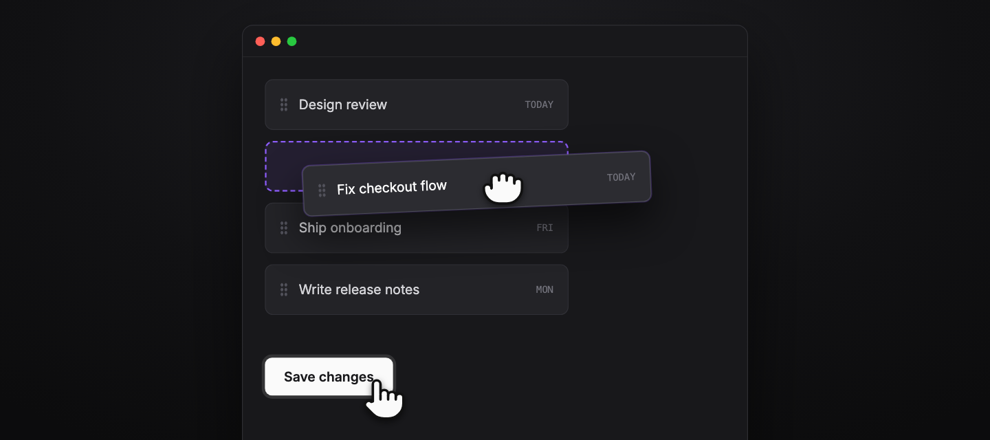
One of my biggest pet peeves with UIs is that so many developers lack the understanding, or the eye, to see proper accessibility. Most have moved to mobile accessibility, which is understandable. But many forget the desktop. They forget the cursor pointer.
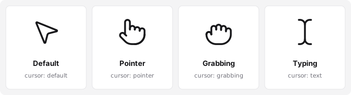
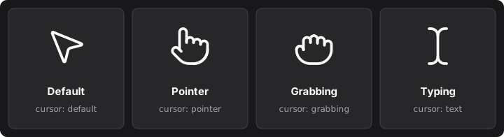
This is my biggest one. When you hover your mouse over a link, a button, or any element or component on the page that does an action, the cursor should adapt and give you that visual cue. And honestly, I'm annoyed that React UI frameworks like shadcn don't support this by default. It shouldn't even be an option. It should be the standard.
Demonstration
The simple examples are the ones so many sites lack. When I mouse over a link, and most importantly a button or a dropdown component, show me the cursor pointer. When I'm using a UI and these cursors are missing, I'm literally put off by it. At that point the product has to drive enough force to get me to keep using it.
It goes beyond hover, too. Take a sortable list of cards, say with SortableJS, where you drag one card to a new spot. While I'm dragging, the visual cues should show me a ghost of the placement where I can drop it, and the cursor should be in grabbing mode. That's how I know I'm the one moving it.
You want the UI to feel clean and tight, and the user should feel in control of the elements. Cursor cues are a huge part of that.
It's like the lighting in your house. Most people don't realize how bad their lighting is until they install calm, soft, warm lighting, or lights they can dim and customize. Then you realize: how did I live with those bright white lights before? How did I never notice how bad it was?
That's UX. It's understanding how the user perceives your app or your website, and how it feels in their hands. It's very, very easy for developers to add this, and more often than not they still fail to realize it's missing. That is a case of bad UX.
And the fix really is easy. If you're using shadcn, the missing pointer comes from Tailwind v4, which switched buttons back to the browser's default arrow. Tailwind's upgrade guide gives you the few lines to bring it back:
@layer base {
  button:not(:disabled),
  [role="button"]:not(:disabled) {
    cursor: pointer;
  }
}
Then go through the rest. Links, buttons, dropdowns, anything that does an action gets the pointer. Anything you can drag shows the grabbing cursor while it moves, and a ghost of where it will land. SortableJS already gives you that placeholder with its ghostClass option. You just have to style it.
So please, use cursor cues in your apps.
Which sites put you off the moment you hover? Tell me on X or Bluesky.
I write about the small UX details most developers miss.